Designing an Alert-First Research Operations Platform
“The new dashboard makes it obvious which projects need follow-up. I can triage alerts, delegate tasks, and feel confident I’m not missing anything important.”
– Responsible Staff Officer
NAPAR is a mission-critical platform used across the National Academies to manage projects, committees, events, and sponsor oversight. I led the redesign of the system into a role-based, workflow-driven experience focused on operational clarity, guided execution, and scalable consistency, introducing structured workflows, alert-driven prioritization, and safer data-entry pathways that reduced ambiguity and improved day-to-day coordination across teams.
Project Snapshot
- My Role: Lead UX Designer — experience strategy, interaction design, research leadership, and design-system integration
- Team: 3 developers, 2 program officers, 1 UX researcher, IT, and cross-functional admins
- Timeline: 5 months (Discovery → Launch) with ongoing iteration
- Scope: Role-based dashboards, alert-routing model, guided project creation, project explorer, and updated project view
Leadership
- Defined the UX vision for role-based dashboards and alert routing
- Mentored developers on token usage, responsive grids, and accessibility
- Coached staff on task-based testing and survey design
- Facilitated cross-functional reviews to align IA, filters, and workflows to real project lifecycles
Context
NAPAR serves as a central operational repository for projects, committees, sponsor oversight, milestones, and events across the National Academies. The platform supports multiple divisions, distributed administrative teams, and workflows shaped by governance and sponsor-driven requirements.
Problem
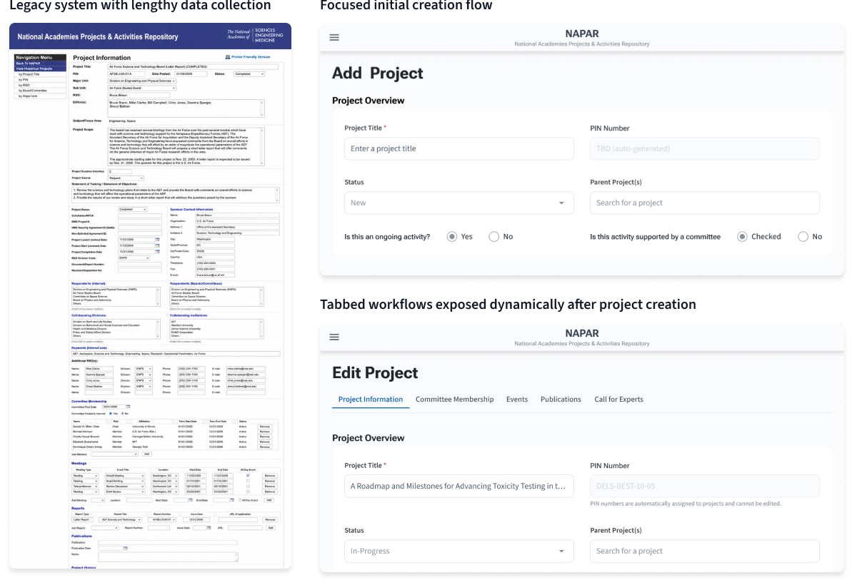
The legacy experience mirrored paper-based operational processes through long, cumbersome forms and fragmented navigation patterns. Users frequently struggled to understand workflow status, determine correct next actions, or safely progress through project and event creation. Uncertainty during data entry led to decision paralysis, duplicate records, inconsistent associations, and increased support overhead.
Solution
I redesigned NAPAR into a modular, workflow-driven system focused on guided execution, role-based prioritization, and reusable semantic patterns. The redesign introduced conditional workflows, structured alert routing, shared interaction models, and safer data-entry pathways that reduced ambiguity while supporting scalability, accessibility, and long-term governance.
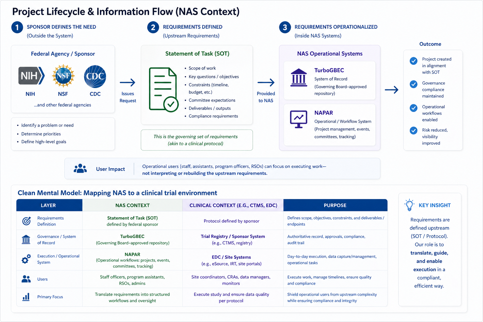
Understanding Upstream Requirements & System Boundaries
One of the core challenges in redesigning NAPAR was that operational requirements were shaped upstream by sponsors, governance processes, and institutional policy. Those requirements then had to be translated into day-to-day project, committee, event, and reporting workflows across multiple systems.
This separation between requirements definition and day-to-day execution created friction. Staff were often forced to interpret incomplete context, increasing the risk of incomplete inputs, inconsistent associations, duplicated effort, and downstream support requests.
The system needed to translate upstream requirements into structured, guided workflows so operational users could execute work without needing to reconstruct intent or interpret governance rules from scratch.
To align stakeholders and clarify system boundaries, I mapped how sponsor-defined requirements flow into NAS systems and ultimately into user-facing workflows.
Research & Strategy
Benchmarking the Current Experience
I ran a baseline usability survey and listening sessions to quantify pain around project creation, event association, and search. We focused on core tasks that directly affected risk and support load.
- Adding/editing projects and events
- Locating projects given partial information
- Understanding whether to edit, associate, or create a new record
Findings pointed clearly to three opportunities: a guided creation flow, a role-aware dashboard, and a more powerful Project Explorer.
42%
Staff uncertain which workflow path to choose
65%
Difficulty linking events to projects
70%
Wanted improved search & filtering
These numbers helped secure buy-in for structural changes, not just “nicer forms.”
Designing for a Multi-Role Ecosystem
NAPAR supports three primary groups: responsible staff officers, program assistants, and federal sponsors. I created personas to clarify their needs, risk tolerance, and mental models, and used them to drive dashboard and alert decisions.
User Personas: Designing for a Multi-Role Ecosystem
To ensure the platform supported both strategic decision makers and day-to-day operators, I led persona work to clarify needs across three core roles.

Occupation: Responsible Staff Officer | Age: 43
Oversees multiple academic projects and working groups; coordinates committee activities and staff. Expected to maintain accurate records and respond quickly to risks or delays.
- Monitor committee activities and project health at a glance
- View and manage committee members, events, and milestones
- Delegate routine updates while retaining oversight and accountability
- Project pages do not clearly surface status or recent activity
- Managing meetings, events, and member bios is fragmented
- Delegation is risky when the system is not intuitive for new staff
- Scans committee activities daily as part of risk monitoring
- Follows up with Program Assistants for accuracy and completeness
- Prefers summarized dashboards with drill-down only when needed
Advanced – deeply familiar with rubrics, phases, and compliance expectations.
- Primarily desktop during work hours
- Mobile when traveling or attending events
“I need a clear status overview so I can make strategic decisions quickly.”
Opens the dashboard each morning to prioritize follow-ups for at-risk projects before committee meetings.

Occupation: Program Assistant | Age: 26
Executes day-to-day project and event updates, uploads materials, and assists with coordination. Highly detail-oriented but still internalizing policy and data rules.
- Quickly add new projects or safely import existing ones
- Add events with confidence that they are linked to the correct project
- Follow step-by-step flows that prevent mistakes
- Unclear whether to edit an existing record, associate work with a project, or create something new
- Not intuitive to link events to the correct project, especially with similar titles
- Hard to track versioned documents and know what is current
- Checks in with Olivia for guidance when the system is ambiguous
- Primarily desktop; prefers structured, guided flows over freeform forms
Beginner – understands core tasks but relies on system cues and checklists.
- Desktop during office hours
- Occasional tablet or mobile for remote uploads
“Just tell me what to upload and where it goes—I will take care of the rest.”

Occupation: Federal Sponsor | Age: 48
Oversees compliance and ensures partner institutions meet funding expectations. Needs to understand project status without getting lost in implementation details.
- Confirm milestones and deadlines are being met
- Ensure compliance with funding terms and reporting expectations
- Access summary views that clearly show risk and progress
- Too many documents and pages to scan for a single view of status
- Slow to identify when interventions are needed
- Unclear how in-progress work is reflected in the system
- Logs in occasionally to prepare for reviews or briefings
- Looks for obvious red/yellow flags to identify issues
- Relies on high-level dashboards rather than edit screens
Why the Old Experience Struggled
The previous “Current Projects” view presented long, text-heavy pages with little visual hierarchy. Projects were discoverable only through narrow lists: by title, by PIN, or by single staff attributes, with no way to combine filters.
Project creation screens were similarly dense, requiring deep institutional knowledge and frequent back-and-forth with IT when mistakes were made.
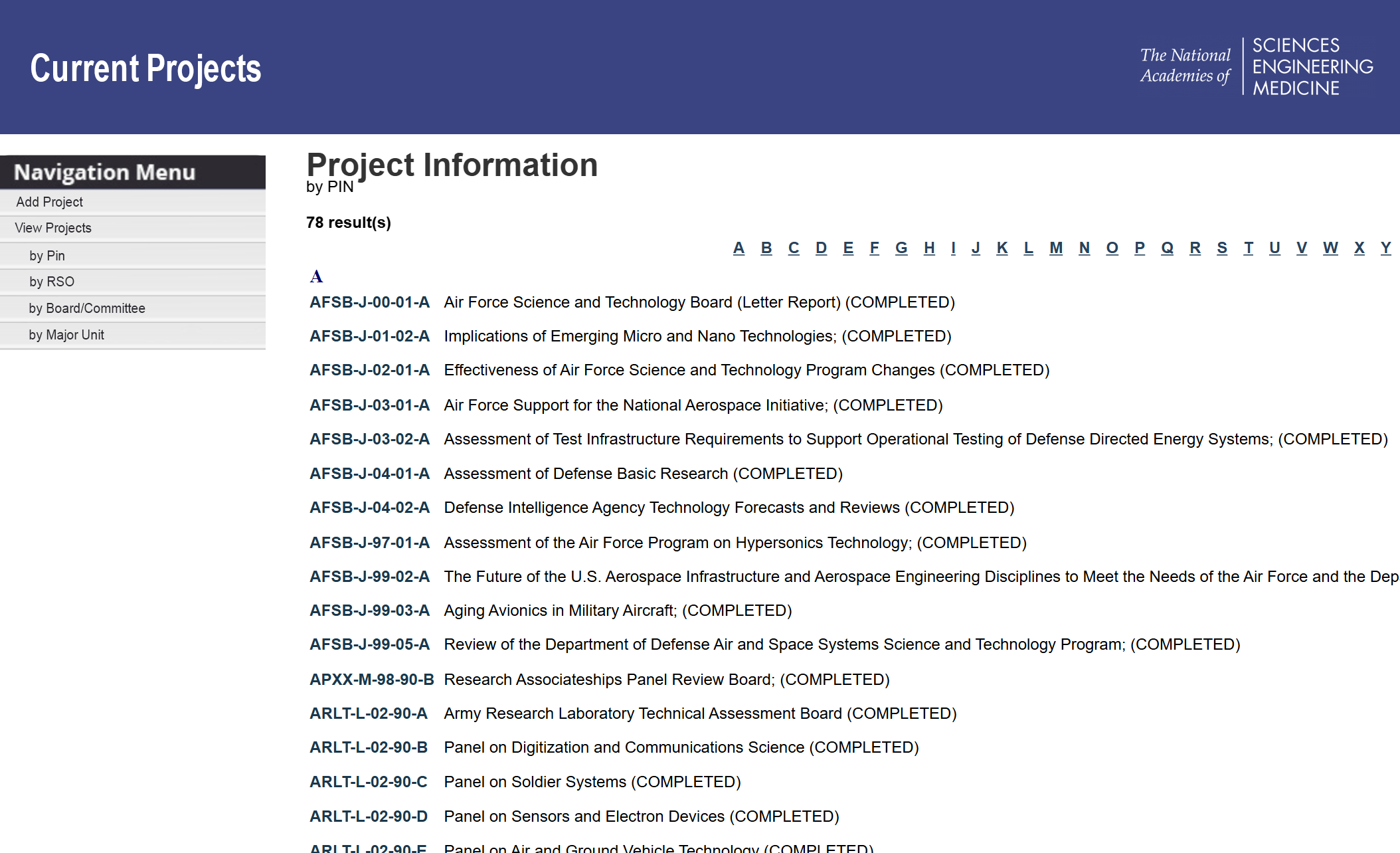
Legacy project view — dense, scroll-heavy, and optimized around forms rather than decision support.
Aligning UI with Operational Structure
One of the core redesign challenges was that the legacy platform mirrored institutional processes too literally. Long, cumbersome forms attempted to expose every operational requirement at once, increasing cognitive load and making workflows difficult to navigate.
Instead of treating the redesign as a visual refresh, I restructured the system around operational progression. Users encountered only the information and actions needed for their current stage of work, while advanced workflows surfaced progressively as prerequisite relationships were established.
- Moved from cumbersome forms to modular workflows
- Introduced progressive disclosure to reduce premature complexity
- Aligned workflows to operational dependencies and system relationships
- Reduced cognitive load during project and event creation
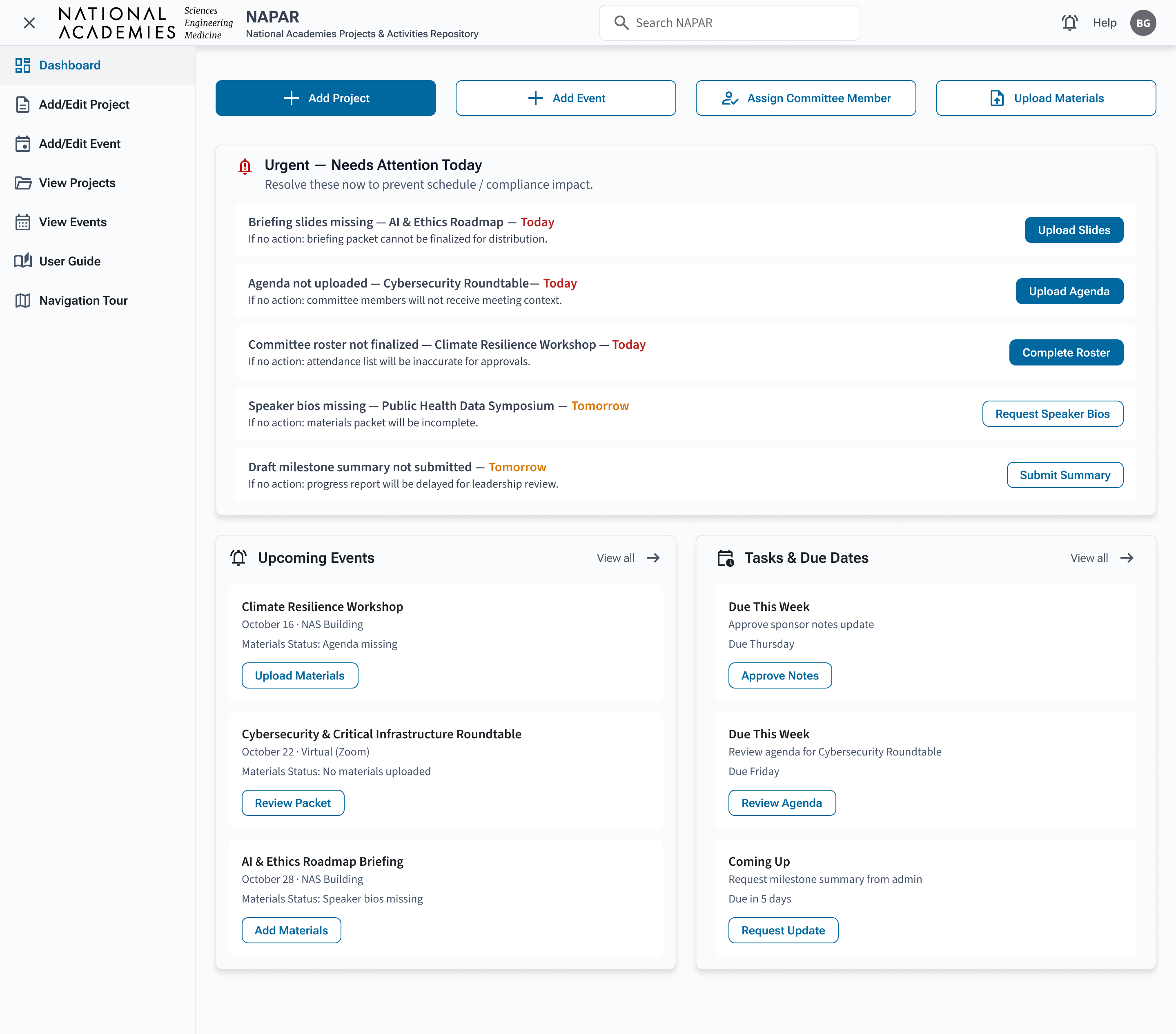
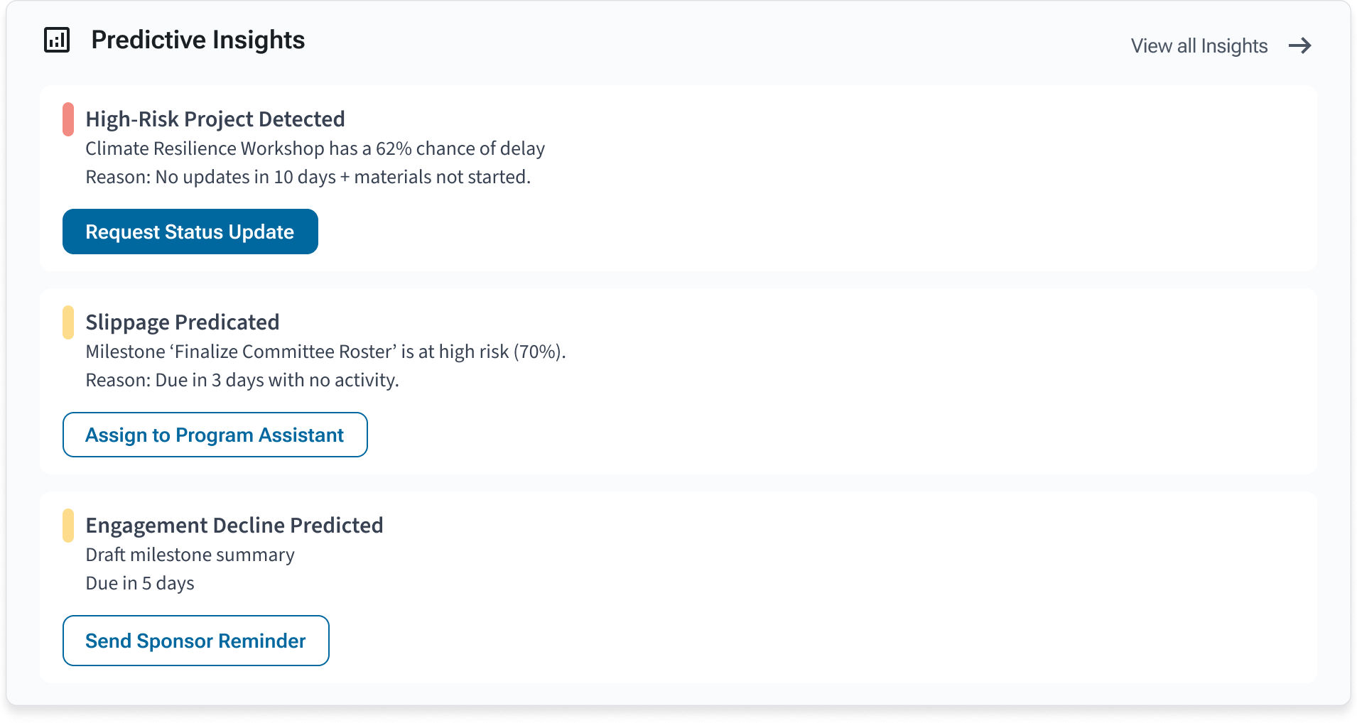
Designing for Action: Role-Based Dashboards & Alert Prioritization
Instead of a one-size-fits-all homepage, I created dashboards tailored to each persona. The guiding principle was reducing cognitive load while increasing accountability: surface what needs action first, then provide drill-down for context. The visual language stays calm and med-tech appropriate — neutral by default, with sparing use of alert color reserved for true urgency (e.g., today/overdue).
- Prioritize urgent work in one place to prevent “alert scatter”
- Make each alert immediately actionable (clear next step + due date)
- Support delegation and triage without requiring users to open multiple pages
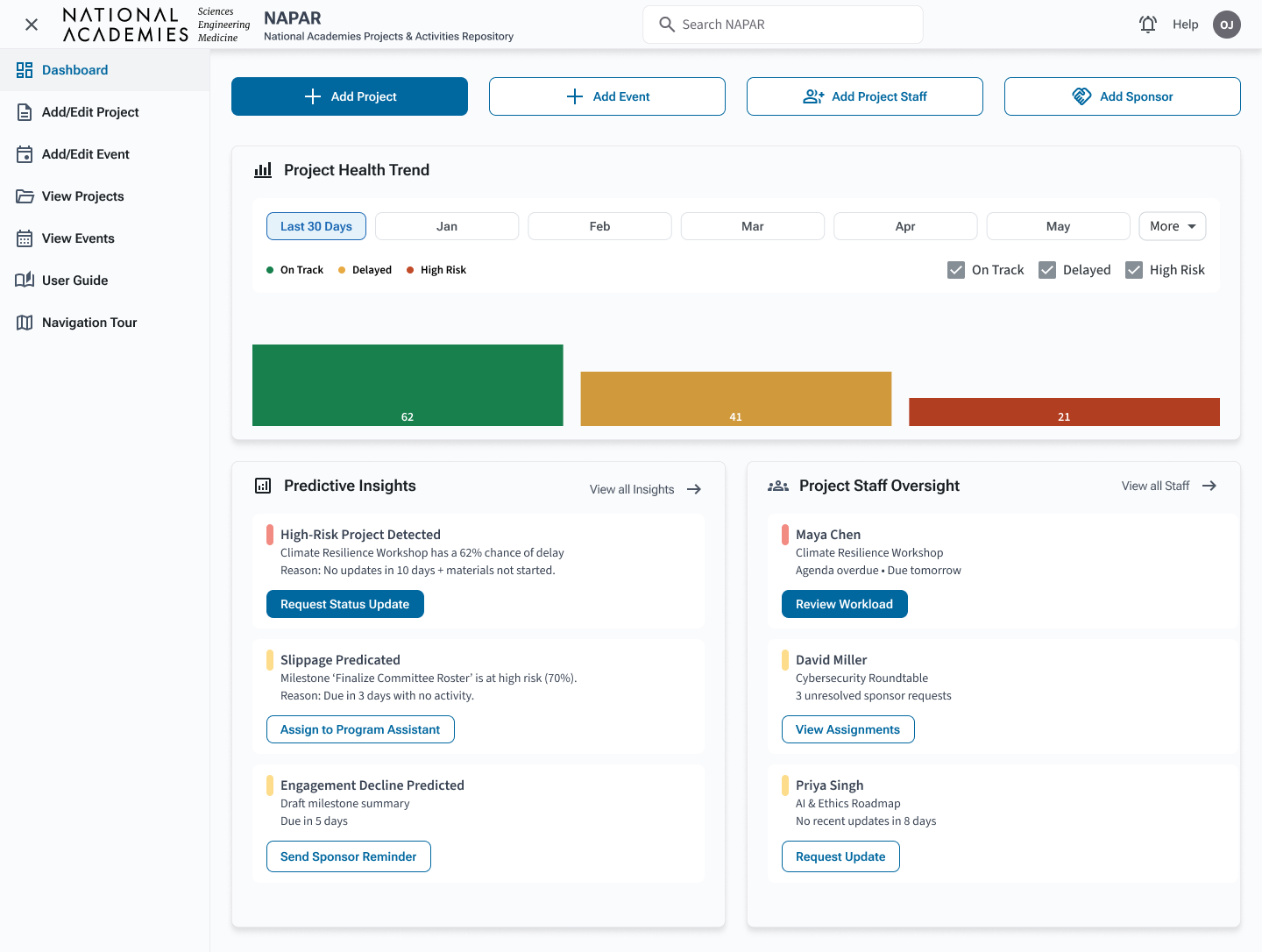
Program Officer / RSO dashboard — portfolio visibility and routed actions support risk monitoring and delegation across multiple projects.
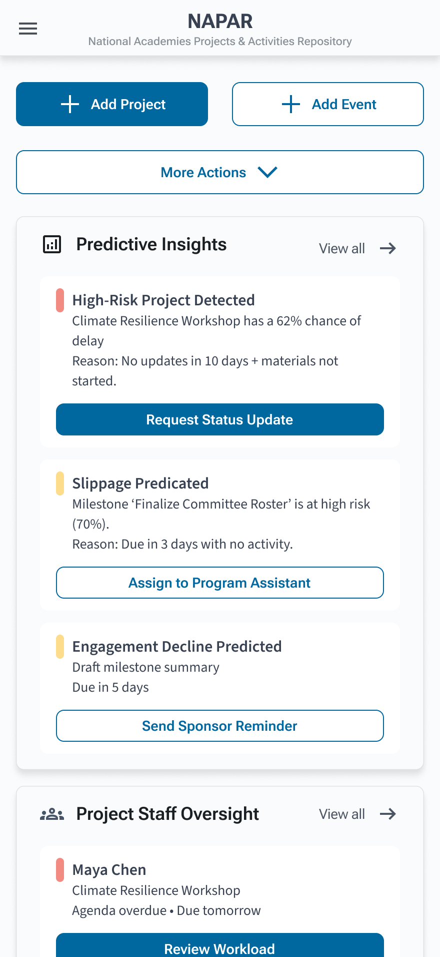
Program Assistants see a variant tuned to execution. Instead of repeating the same task logic across multiple widgets, urgent work is consolidated into a single “Needs Attention Today” list with due dates and consequence-driven context, helping assistants act quickly and confidently. The rest of the dashboard stays intentionally lightweight: a small welcome card for orientation and an Upcoming Events card to support packet and materials preparation.
- Reduces overwhelm by giving tasks a single “home”
- Makes urgency scannable (Today / Tomorrow / Overdue)
- Connects action to impact (“If no action…”) to prevent missed prep work
Program Assistant dashboard — urgent actions consolidated into a single, scannable list, supported by lightweight context and upcoming-event prep.
Happy Path: Resolve “Committee roster not finalized”
From Beatrice’s dashboard, the overdue roster alert routes directly to the Committee Membership tab. The experience de-escalates urgency from the dashboard into an instructional warning, confirms context, and presents a single primary action to finalize the roster.
- Routes from: Urgent alert card → Committee Membership
- Guidance: warning state + one primary resolution action
- Outcome: resolved item automatically removed from Urgent alerts
On mobile, the dashboard collapses into a focused, scrollable layout with a short primary CTA strip (Add Project, Add Event) and the urgent list above the fold. This preserves the same prioritization model across devices, reducing cognitive switching and helping staff act quickly while traveling or supporting events on-site.
Component Highlights: Designing for Consistency at Scale
Because NAPAR supports multiple roles, divisions, and workflow types, consistency could not rely on visual styling alone. I established reusable semantic interaction patterns that standardized hierarchy, severity behavior, spacing, CTA structure, and accessibility behavior across dashboards, workflows, and modals.
This created a shared operational language across the platform while reducing implementation drift and supporting long-term scalability.
- Faster comprehension: repeatable patterns reduce re-learning across pages
- Safer execution: clearer inputs + error states reduce data-entry risk
- Scalable delivery: shared components accelerate build and future enhancements
Alert Cards & Routed Actions
Alerts are designed to be scannable (severity + short description) and actionable (clear next step), with routing logic that ensures each item reaches the correct owner. This reduces triage time and eliminates ambiguity about what needs to happen next.
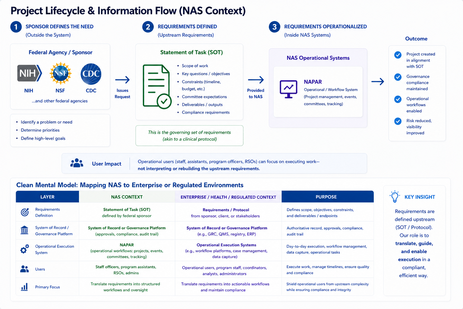
By structuring alerts around consistent metadata (due dates, ownership, project state, and consequences), the system also establishes a foundation for AI-assisted prioritization. Instead of treating alerts as static notifications, this model supports dynamic ranking, summarization, and future decision support.
- Summarize multiple alerts into a single “what needs attention and why” view
- Predict risk escalation based on missed milestones or historical patterns
- Recommend next steps based on similar past resolutions
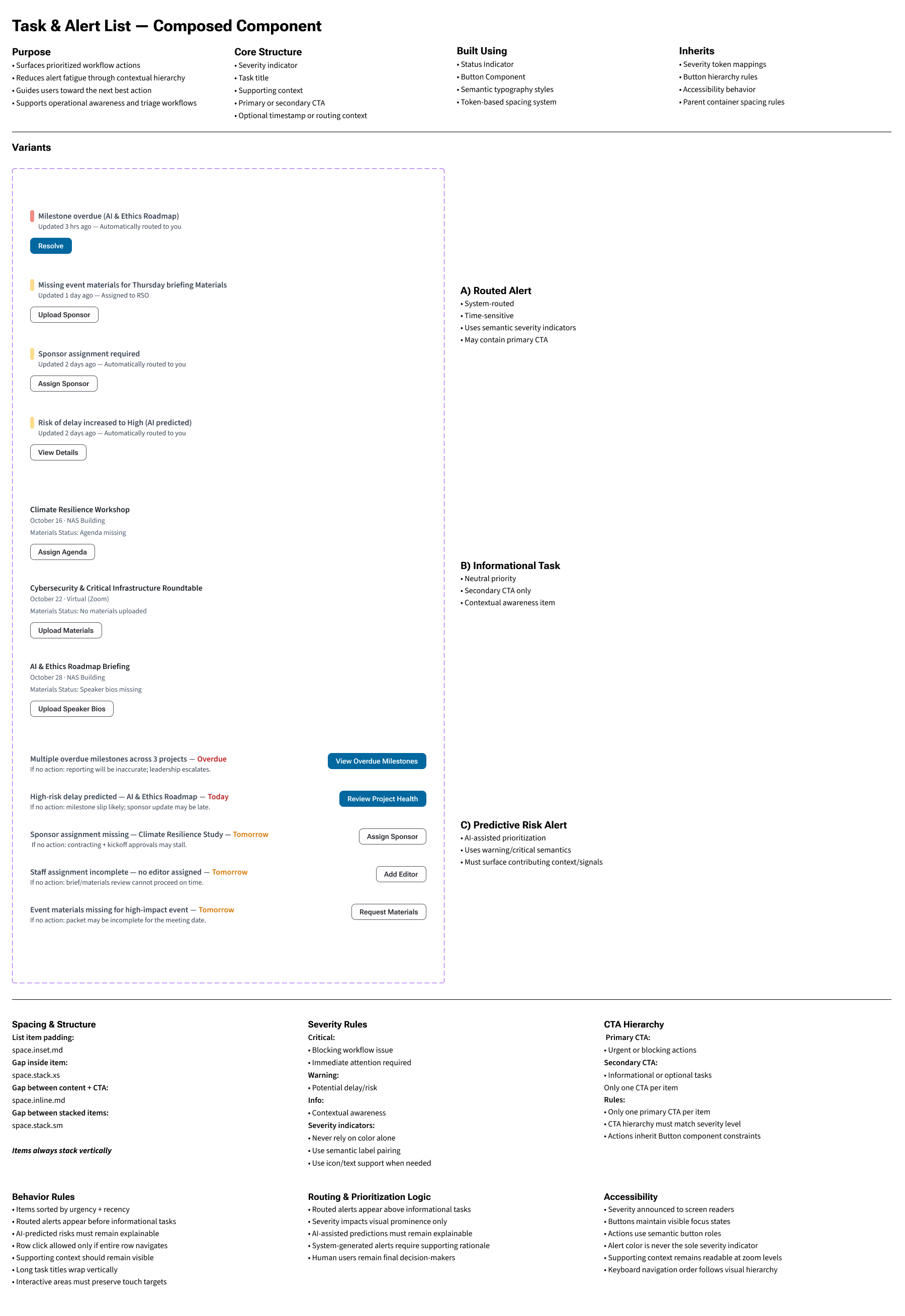
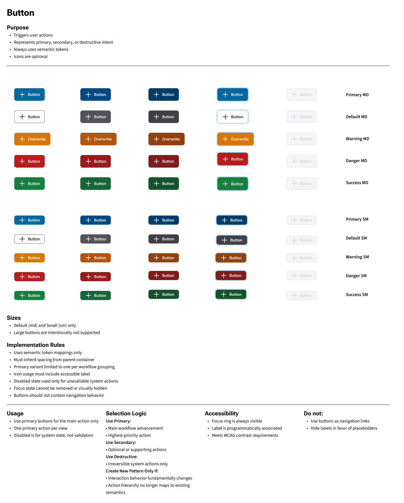
Button System: Variants & States
Primary, secondary, and status variants follow a consistent hierarchy across default/hover/active/focus, reinforcing which actions are most important while maintaining accessible focus treatment.
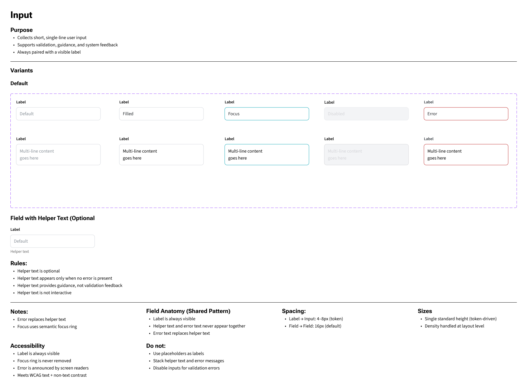
Form Inputs: Focus, Disabled, and Error
Input states prioritize clarity and restraint: neutral by default, strong focus visibility for keyboard navigation, and concise error messaging to reduce correction time and prevent submission failures.
These component patterns were reused across dashboards, the Project Explorer, and guided modals to reduce cognitive load and ensure consistent implementation.
Governance & Scalable Decision Structures
Because the platform served multiple divisions and operational teams, scalability depended on governance as much as interface design. Without shared decision structures, workflows risked fragmenting into inconsistent one-off solutions.
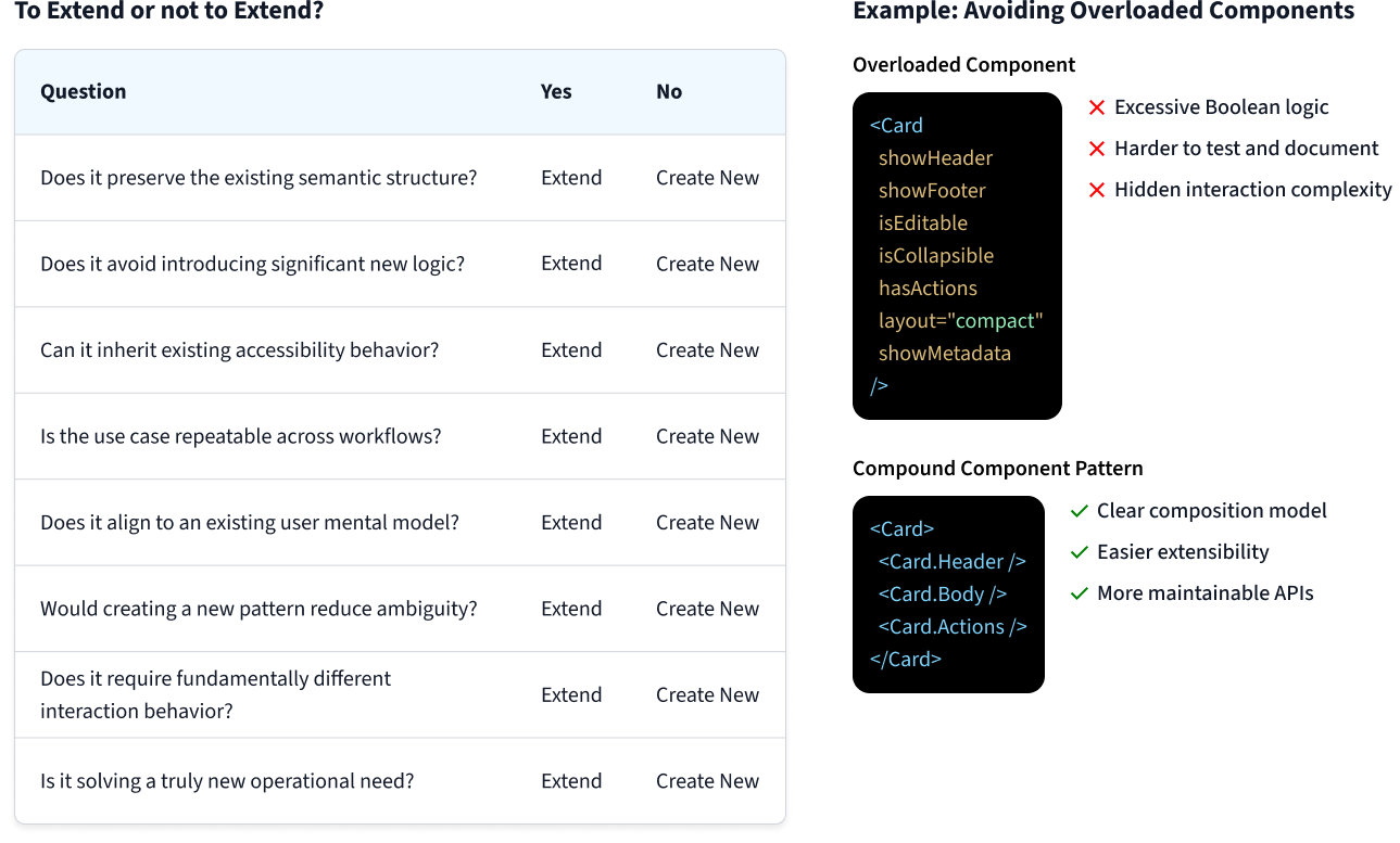
I helped establish reusable evaluation patterns for extending existing workflows versus introducing new interaction models. This reduced unnecessary divergence while keeping the system flexible enough to support evolving operational needs.
- Extend existing patterns before creating new ones
- Preserve shared semantic structure across workflows
- Reduce overloaded components and hidden interaction complexity
- Ensure accessibility behavior remained inherited by default
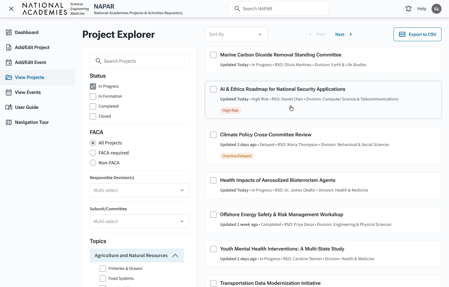
Project Explorer: Consolidated Search & Filtering
The previous system split search across multiple pages (advanced search, view by title, view by PIN, and more). I merged these into a single Project Explorer with a left-hand filter rail and scrollable result cards on the right.
- Global search in the header for known titles or IDs
- Facet filters for status, FACA, division, committee, and topics
- Inline metadata (updated date, RSO, division) for each project card
- Severity badges (e.g., “High Risk”, “Overdue/Delayed”) reserved for time-sensitive issues
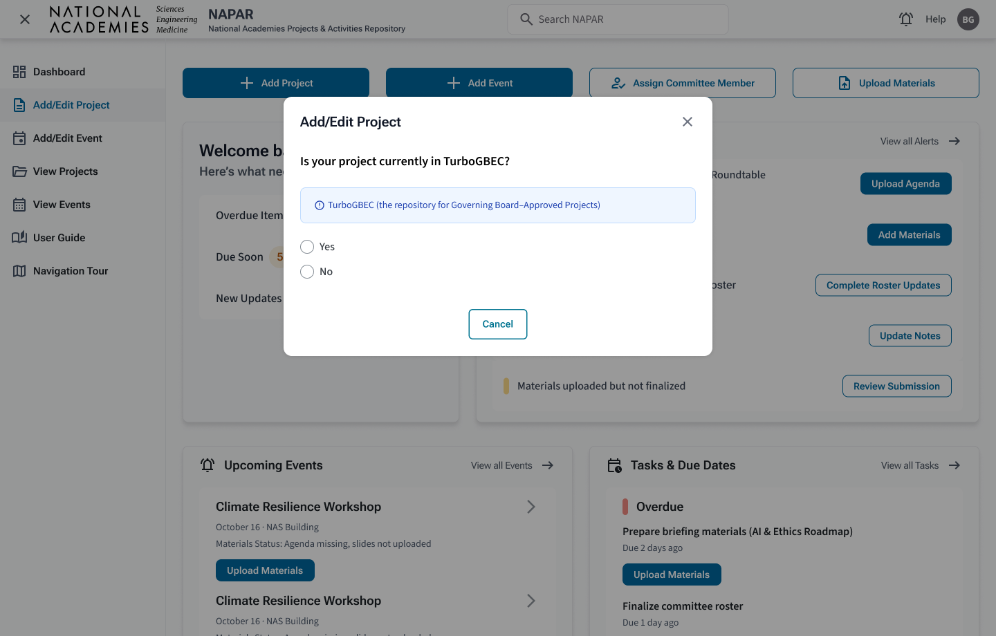
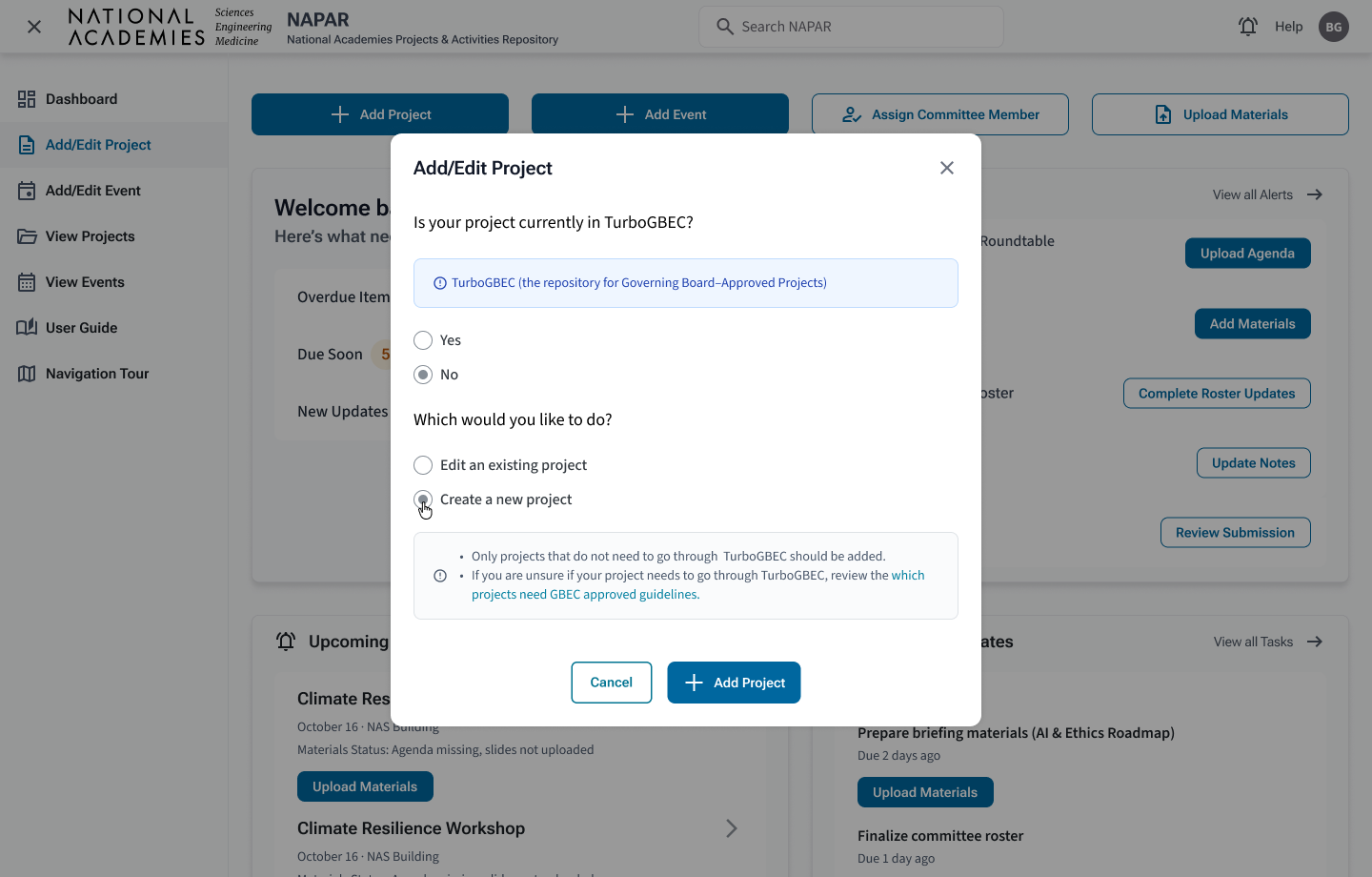
Guided Workflows Through System Logic
Before the redesign, staff often hesitated during project and event creation because the system did not make the correct path obvious. Users had to decide whether they were editing an existing record, associating work with a project, or creating something new without enough guidance.
I introduced a guided workflow model that moves the most important decision to the beginning of the flow. Instead of exposing a long form immediately, the modal first asks users what they are trying to accomplish, then reveals only the fields and search steps needed for that path.
- Edit existing record – search and update a known project or event.
- Create project-associated work – connect the new item to the correct project before continuing.
- Create standalone item – support valid one-off work without forcing unnecessary associations.
This reduced ambiguity at the source, improved data quality, and helped newer staff move through complex workflows without relying on institutional knowledge.
Guided workflow pattern — critical decisions first, conditional logic second.
Step 1 The flow begins with a clear intent question so users do not start with an overwhelming form.
Step 2 Search and confirmation steps help users validate context before editing or associating work.
Step 3 New creation is supported only after the system has helped users rule out existing records.
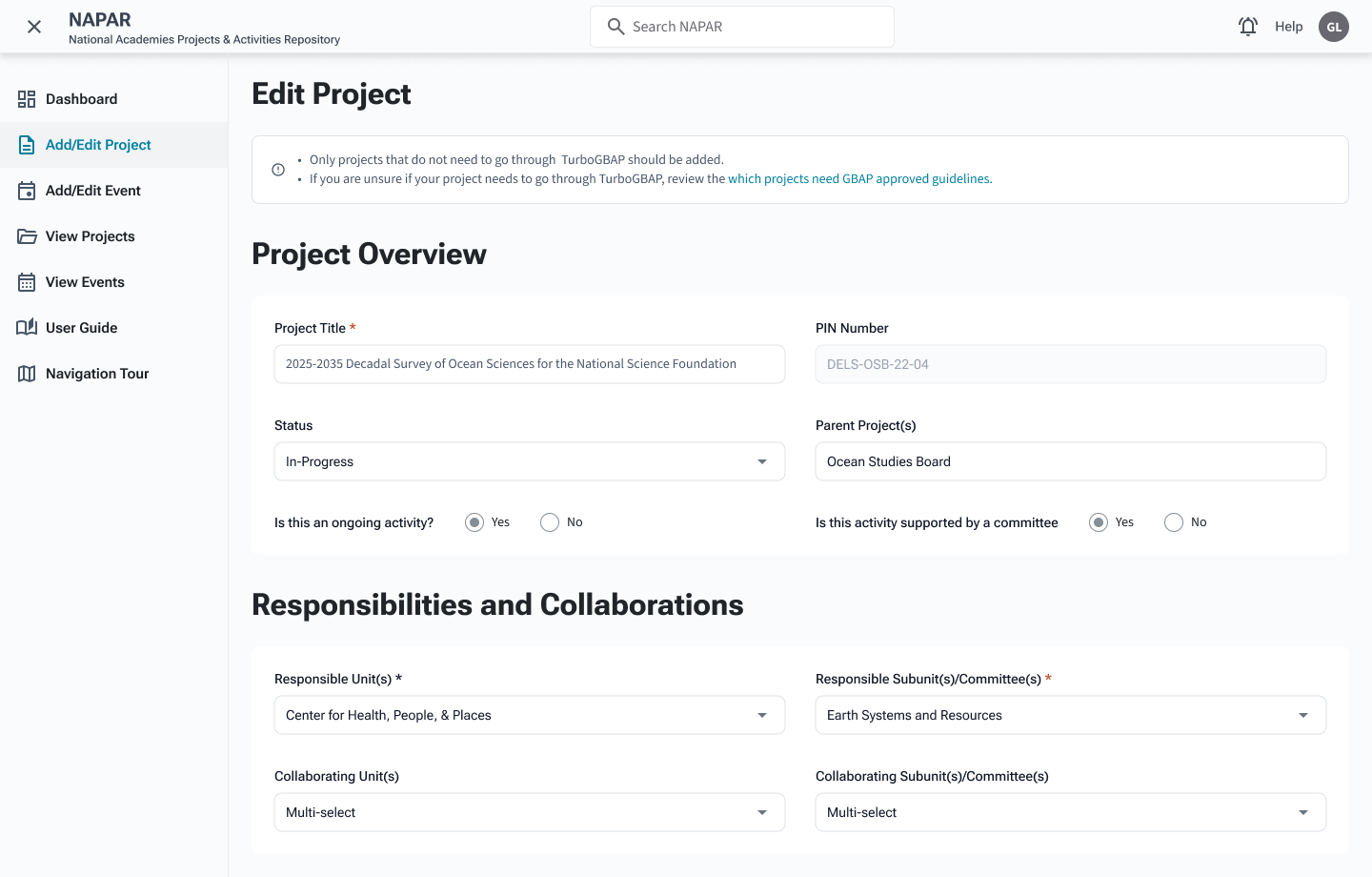
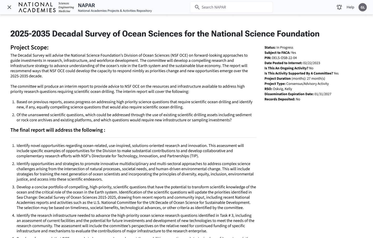
Project View: Clear, At-a-Glance Context for Sponsors and Staff
Once a project is selected, stakeholders need a concise status story: where the project sits in its lifecycle, which events and milestones are upcoming or overdue, and who is responsible.
The redesigned project view uses a modular layout — overview, responsibilities, committee membership, events — with clear headings and restrained typography so sponsors like Edward can scan before drilling into documentation.
Building an AI-Ready Operational Foundation
Although NAPAR was not originally designed as an AI-native platform, the redesign established structural foundations that support future AI-assisted workflows.
Alerts, workflow states, ownership metadata, severity logic, and semantic interaction patterns were intentionally standardized, creating a more machine-readable operational system.
- Summarize operational risk across projects
- Predict workflow bottlenecks and overdue milestones
- Recommend routing and next actions
- Support AI-assisted prioritization while preserving human oversight
Business Impact Summary
Staff reported a 33% improvement in workflow efficiency, driven by role-based dashboards and a clearer prioritization model: urgent actions were consolidated into a single, actionable list (due dates + next steps), reducing time spent re-triaging the same work across multiple widgets.
Severity badges, workflow states, and routed alerts help teams identify high-risk projects and missing materials sooner, while creating a foundation for future AI-assisted risk summarization and proactive intervention.
Clearer flows around project creation and event association contributed to a 40% reduction in IT support tickets, freeing capacity for higher-value work.
Outcome & Next Phase
The redesign transformed NAPAR from a fragmented, form-heavy repository into a structured, workflow-driven operational platform. Staff could execute work with greater confidence, Program Officers gained clearer visibility into project health and risk, and the organization established a stronger foundation for scalable governance and long-term system evolution.
Beyond the interface redesign itself, the project helped establish reusable workflow patterns, semantic interaction structures, accessibility-aligned components, and governance principles that could scale across future systems and modernization efforts.